Alongside a group of my peers within my program, we were tasked to create a social campaign for ParticipACTION that informed the youth of how their generations lack of physical activity is going to effect them. With this, we created the #LetsStayActive campaign that helped inform kids of the easy of staying active day to day, and the many benefits phsyical activity has on your growing body.
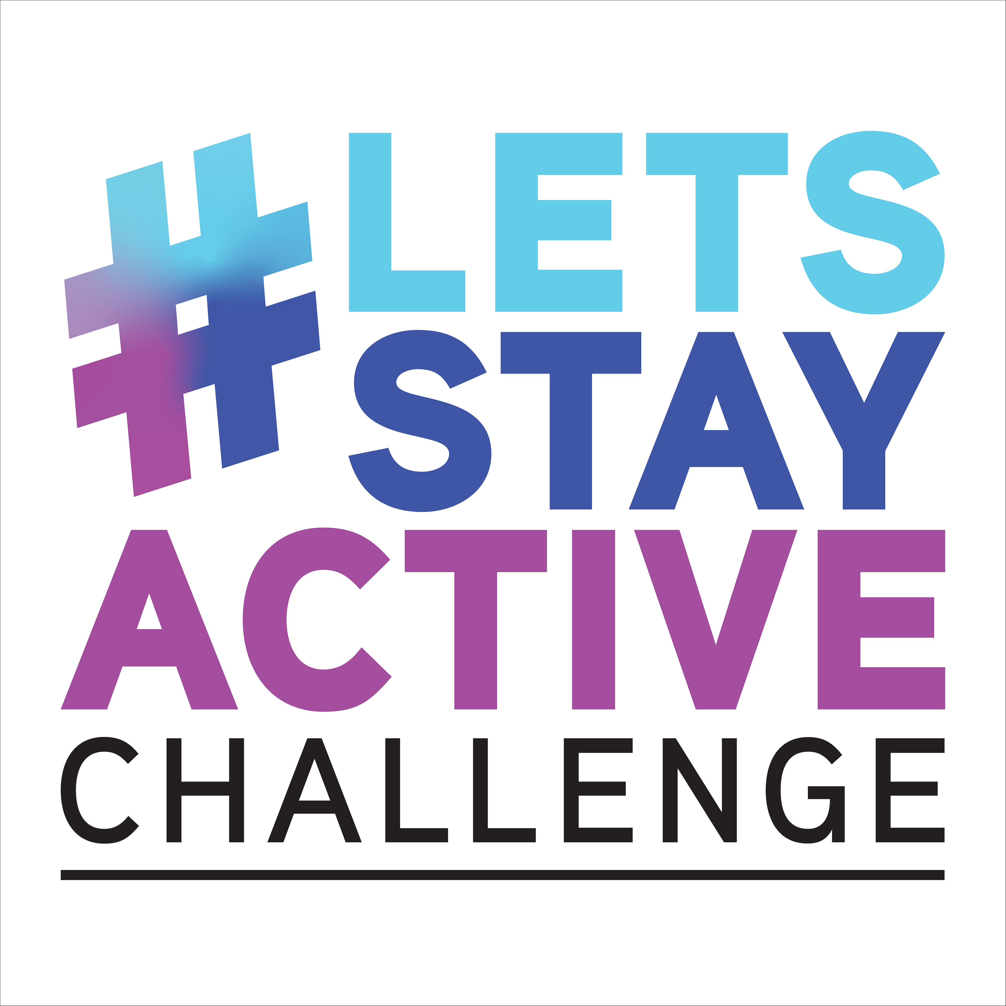
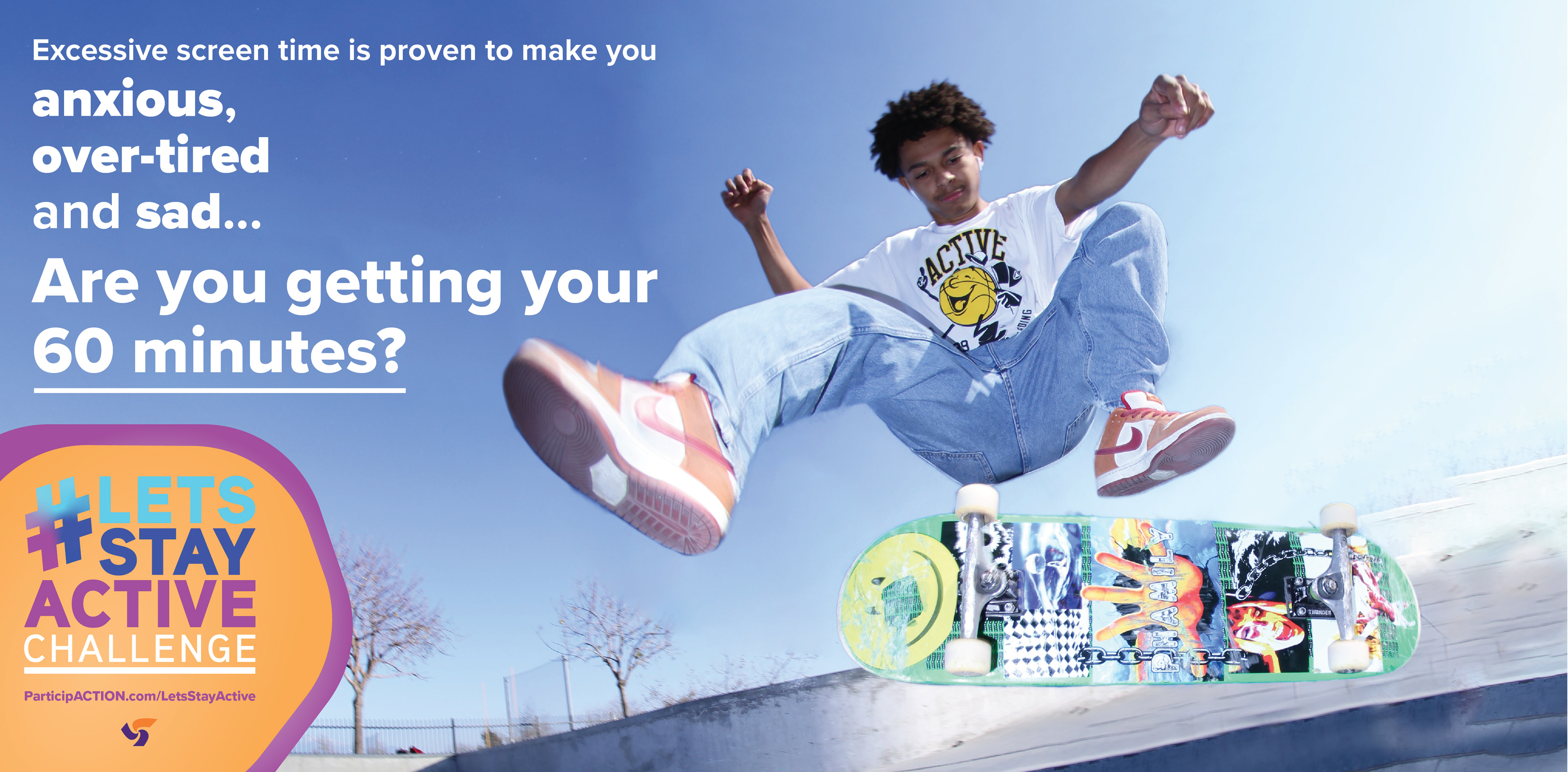
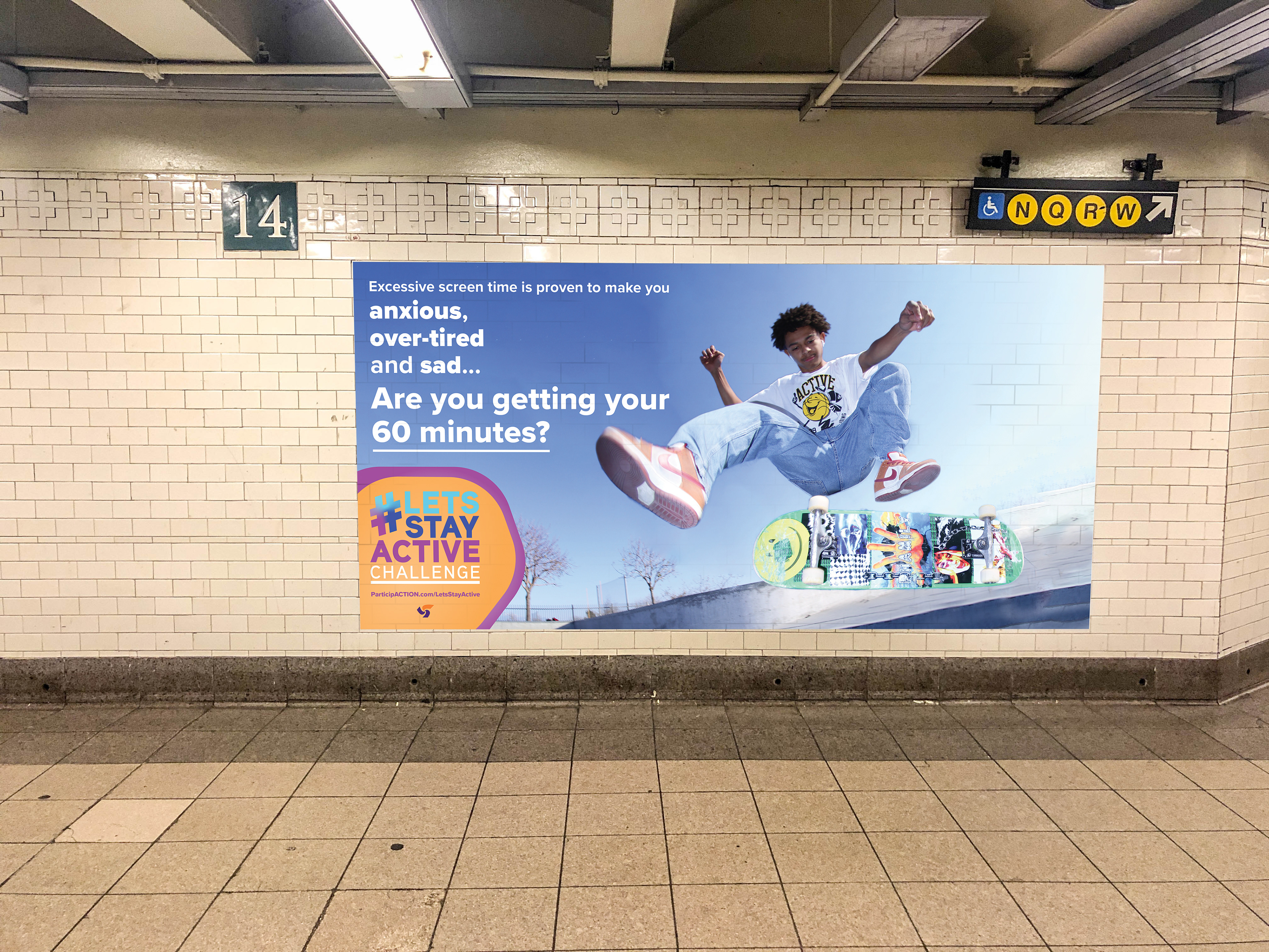
I was tasked with creating the logo for this campaign, which with the use of bold sans-serif type as well as a cool, calm colour pallette, puts the idea to the forefront of the viewers attention without overwhelming them with a complex colour pallette. The use of the hashtag pushes forward immediately that it's a social campaign. I was also tasked with creating a poster advertisement to be placed within public transit. In which I used a variation of bold and semibold type to convey the urgency of the keywords being said within the poster. The overall visual presents itself very strongly with the use of brand colours in the bottom corner combined with our logo. As well, the visual of a skateboarder helps push forward the variety of ways that the youth can get physical activity.
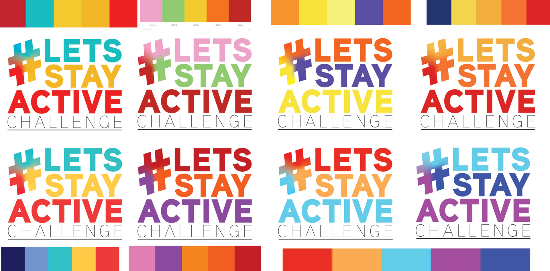
Process Shown Below: Logo compositions and colour pallette choices. In this case I experimented a lot with variated types of colour pallettes to see how they would make the same logo appear. In which as mentioned previously, I decided on the last colour pallete as it showed itself very calmly in contrast to the bold use of the "Aaux Next" typeface.
Final Logo: